One picture, is worth a thousand words.
Images evoke emotion. They can tell a story—true or not—in a matter of seconds. Sometimes, in an instant. Images help us remember things. Both the good, and the bad. And they can set a tone for what we’re about to experience … photos that accompany magazine articles give us clues to the content long before we’ve read the first sentence. A label on a bottle of wine can fool someone into thinking they’re getting an expensive Chardonnay when in fact, they are not—it’s why wine tastings are often “blind.” So, our minds aren’t corrupted by any preconceived judgment based solely on the label.
You can’t judge a book by its cover.
No? But we do. All the time. It’s an instinct to be attracted to something that appeals to us … be it a bottle of wine, another human, a house, a box of cereal, or a book cover. Likewise, it’s in our nature to forgo the “things” that don’t appeal to us. At least at first glance.
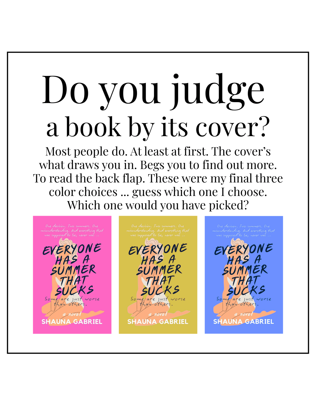
And so, when deciding on a cover design for my book, it wasn’t something I took lightly. I did, in fact, scour bookshelves of the top sellers and read umpteen articles on design choice … what images are popular (turns out bicycles and dress figures and birds top the list); what colors are popular (millennial pink—have you heard of it?); what styles are popular (minimalist, etc.). I even read one very interesting piece that discussed the many book covers out there that have absolutely nothing to do with the content and whether that was a good approach. (Eh. Marketing.)
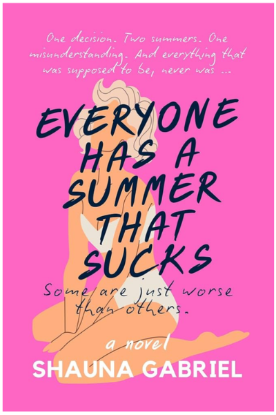
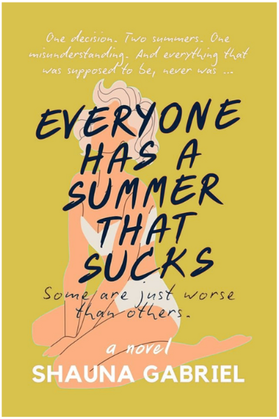
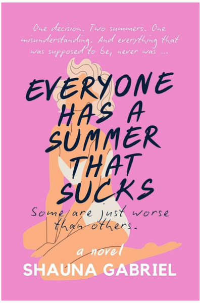
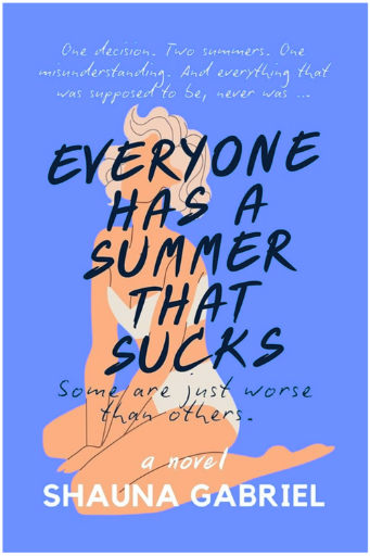
Anyhoo … I opted to keep it simple but found myself vacillating on the background color. Ultimately, I went with a brighter version of millennial pink (and yes, it’s a real thing—Google it). But I am curious. What would you have chosen? Image and fonts aside (because that’s a discussion for another post), what color scheme appeals more to you?
